Introduction
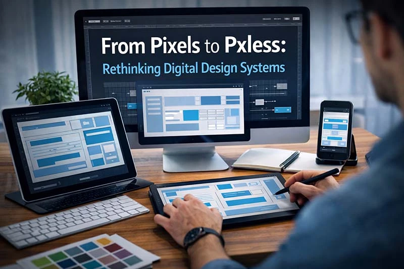
Digital design has undergone a dramatic transformation over the past decade. As screens multiply and user expectations evolve, designers are moving away from rigid, fixed measurements toward more adaptive systems that respond intelligently to context and device behavior. This shift has given rise to Pxless, a modern design philosophy focused on flexibility, scalability, and device-independent user experiences. Rather than designing interfaces locked to pixel-perfect precision, today’s creators prioritize adaptability, accessibility, and long-term usability across an ever-expanding digital ecosystem.
The Evolution of Digital Design Systems
In the early days of web design, pixels were the foundation of everything. Designers carefully controlled spacing, typography, and layouts using fixed measurements to ensure visual consistency. This approach worked well when most users accessed websites through similar desktop screens.
However, the digital landscape changed rapidly with the introduction of:
-
Smartphones and tablets
-
High-resolution displays
-
Wearables and smart TVs
-
Variable screen sizes and orientations
A layout that looked perfect on one screen could easily break on another. Fixed measurements began to limit creativity and usability rather than enhance them.
Modern design systems now emphasize flexibility. Instead of asking, “How many pixels wide should this element be?” designers ask, “How should this element behave across environments?” This mindset shift laid the groundwork for more adaptive approaches to interface creation.
What Pxless Means in Modern UI and UX
At its core, Pxless represents a philosophy rather than a single technical tool. It encourages designers and developers to move beyond rigid pixel measurements and instead rely on scalable units and responsive structures.
Key ideas behind this approach include:
-
Designing layouts that adapt naturally to screen size
-
Using relative units instead of fixed values
-
Building components that scale consistently
-
Prioritizing usability over visual rigidity
This does not mean pixels disappear entirely. Instead, they become less central to decision-making. Designers focus more on relationships between elements — spacing, hierarchy, and readability — rather than exact numerical dimensions.
The result is a design system capable of evolving alongside technology instead of constantly needing redesign.
Why Pxless Is Transforming Digital Design Systems
The growing adoption of Pxless principles reflects deeper changes in how products are built and experienced. Modern digital products must function seamlessly across countless contexts, from mobile apps to large desktop dashboards.
1. Device Diversity Demands Flexibility
Users switch between devices constantly. Fixed layouts struggle to maintain consistency, while flexible systems adapt automatically.
2. Accessibility Becomes a Priority
Accessibility guidelines encourage scalable typography and adaptable layouts. Relative sizing allows users to adjust content without breaking interface structure.
3. Faster Development Workflows
Reusable, scalable components reduce redesign work. Teams can maintain consistency across products using shared design tokens and responsive rules.
4. Future-Proof Interfaces
Technology evolves quickly. Systems designed around behavior rather than static measurements remain usable longer.
Organizations adopting modern design systems increasingly recognize that adaptability is more valuable than visual perfection.
Core Principles Behind Pxless Design Thinking
Understanding the philosophy requires looking at the principles guiding modern interface creation.
Fluid Layouts Instead of Fixed Grids
Traditional layouts depended on exact widths. Fluid layouts expand or contract based on available space, improving usability across devices.
Relative Units Over Absolute Measurements
Designers increasingly use scalable units such as:
-
rem and em for typography
-
percentages for layout spacing
-
viewport units (vw and vh) for responsive sizing
These allow elements to scale proportionally rather than remain fixed.
Component-Based Design Systems
Reusable UI components ensure consistency without relying on strict pixel values. Each component adapts intelligently to its environment.
Content-First Design
Instead of forcing content into predefined dimensions, layouts respond to the content itself — improving readability and user engagement.
Pxless in Real-World Design Workflows
Adopting Pxless is not just theoretical; it directly affects everyday workflows for designers and developers.
Design Phase
Designers focus on relationships and hierarchy rather than exact spacing numbers. Tools like Figma and modern design systems encourage constraints and auto-layout features.
Development Phase
Developers translate designs using flexible CSS techniques, responsive grids, and scalable typography.
Collaboration Benefits
When teams work with flexible systems:
-
Fewer layout inconsistencies occur
-
Handoff between designers and developers improves
-
Updates require less rework
This approach reduces friction across product teams and allows faster iteration cycles.
Comparing Pixel-Perfect Design vs Adaptive Systems
For years, “pixel-perfect design” was considered the gold standard. Today, many teams view it differently.
Pixel-Based Approach
-
Highly controlled visuals
-
Difficult scaling across devices
-
Frequent redesign required
-
Less adaptable to accessibility needs
Adaptive System Approach
-
Flexible and responsive layouts
-
Better long-term scalability
-
Improved performance across screen sizes
-
Greater user inclusivity
The industry is not abandoning precision — it is redefining it. Precision now means consistent experience rather than identical appearance.
The Role of Accessibility and Inclusive Design
Modern design must work for everyone. Flexible systems support accessibility in ways rigid layouts cannot.
For example:
-
Users can increase text size without breaking layouts
-
Interfaces adapt to assistive technologies
-
Content remains readable across zoom levels
Organizations increasingly align with accessibility standards such as the Web Content Accessibility Guidelines (WCAG). You can learn more about accessibility best practices from the World Wide Web Consortium (W3C).
Design approaches that prioritize adaptability naturally align with inclusive design principles, making them essential for modern digital products.
Common Misunderstandings Around Pxless Design
As with many emerging design approaches, new ideas are often misunderstood during early adoption. Several assumptions about modern flexible design systems can create confusion for teams transitioning away from traditional workflows.
It Does Not Remove Creative or Visual Control
Some designers worry that moving away from fixed measurements reduces precision. In reality, control shifts from rigid dimensions to structured behavior. Designers still define spacing, hierarchy, and visual rhythm — but interfaces are allowed to adapt intelligently to different environments.
It Is Not Only a Developer Concept
Flexible design thinking is sometimes viewed as purely technical. However, many of the decisions begin during the design phase. Layout behavior, scalable typography, and responsive components are often planned long before development starts, making collaboration between designers and developers more seamless.
Adaptability Does Not Mean Less Precision
Precision in modern interfaces is measured by consistency of experience rather than identical appearance on every screen. A layout that adjusts smoothly while maintaining usability demonstrates a higher level of design accuracy than one locked to a single display size.
The Future of Digital Interfaces
Digital products are expanding beyond traditional screens into augmented reality, smart devices, and immersive environments. Static measurement systems struggle in these contexts.
Future design trends point toward:
-
Context-aware interfaces
-
Adaptive typography systems
-
AI-assisted layout adjustments
-
Cross-platform design ecosystems
As technology evolves, flexible design philosophies will likely become the default rather than the exception. Designers who embrace adaptability today position themselves ahead of industry change.
Frequently Asked Questions
What does Pxless mean in web design?
It refers to a design philosophy that reduces reliance on fixed pixel measurements and emphasizes flexible, scalable layouts that adapt across devices.
Is pixel-based design outdated?
Not entirely. Pixels are still useful, but modern workflows rely more on responsive systems to ensure usability across diverse environments.
Do designers need coding knowledge to use Pxless concepts?
Basic understanding of responsive behavior helps, but many modern design tools already support flexible layout systems visually.
Does this approach improve website performance?
Flexible systems often reduce layout issues and improve usability, which can positively influence performance and user engagement.
Conclusion
The shift toward adaptable interfaces reflects a broader transformation in how digital products are conceived and built. By prioritizing flexibility, scalability, and accessibility, designers create experiences that remain effective across changing technologies and user needs. Ultimately, Pxless represents more than a technical adjustment — it signals a new mindset focused on designing systems that evolve alongside the digital world.
Also Read: How Schedow Reflects the Future of Time Management